Samsung Fold
As the Creative Director of the team that worked on the new category of Samsung smartphones, we set out to develop the brand's visual identity.
The team set out to emphasize the form factor with an ultra-premium design identity that set the brand apart from its competitors.
The butterfly image used across all launch visuals
—
The butterfly idea humanizes the brand and celebrates the product technology creating a dynamic visual that resonates the world over.
—
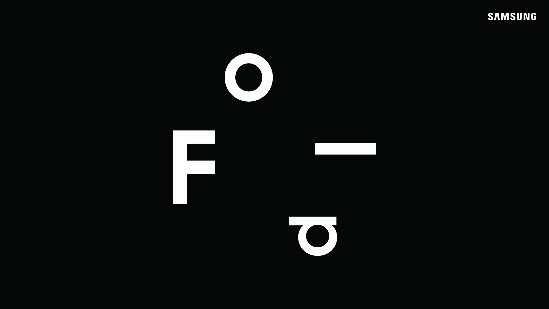
The typography reflected the name of the product and creates a departure from standard Samsung guidelines
—
The black and white design system, with hits of color to differentiate and compliment the Galaxy Mobile brand, was carefully crafted to communicate the brand's unique value proposition and appeal to the target audience.
—
—
The team collaborated closely with client agencies to ensure that the launch and subsequent marketing efforts effectively communicated the brand's message and resonated with consumers.
—
Fold teaser campaign
Fold Key Visual developed for the global campaign
Fold campaign lifestyle photography used globally for campaign work (shot with Wolfgang Zac in LA)
—
An photoshoot and image library were planned and produced. Regional markets were supported with imagery to help their market launches.
—
Fold Key Visuals deployed globally with media aimed at premium markets
Fold Key Visuals and lifestyle photography campaign work
Fold packaging including a slip case and different butterfly colors to correspond with the product color
Fold UI design
Galaxy Fold at the Unpacked launch event in San Francisco
Secondary Galaxy Fold launch visual used at Unpacked in San Francisco


